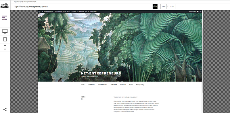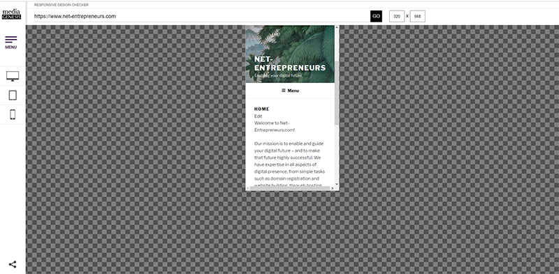
Modern website design and build has changed. These days, more than 50% of internet traffic (2018) is by mobile phone. There are also millions out there using tablets of various resolutions rather than classic laptops or desktops to access the internet. The lesson is simple. If you want to maximise your online exposure, your website and offering must render well on all devices, whatever their resolution (be fully responsive). That is why, here at Net-entrepreneurs.com, we design and build all websites with this basic principal in mind.
Check out the Media Genesis Responsive Design Checker at https://responsivedesignchecker.com